Everyone's favourite... the
One Layer Challenge
One Layer Challenge
and this week it's really simple
3
Three of anything that is, three colours, three images, three stamps, three words, the number three.... it's up to you, but don't forget the white space, a simple design and just one layer!
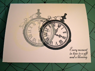
I didn't think I'd have time to do this week's Less is More challenge, but I had an idea that would fit this challenge perfectly, so I made the time for it. Here is is:
I wanted to print "Time Flies" in the corner, but, well time constraints and all (note to self, get a stamp that says Time Flies). Besides, the sentiment I used is pretty awesome. I wanted the feeling of time passing and becoming more distinct and real (as you can no longer affect times past). The close-up is to show the white stamp. It's barely visible in real life, though you can catch glimpses of it if you tilt the card or look closely. And yes, the clock numbers for that stamp are somewhat out of line (you try stamping white on white while matching a previous stamp). The Key Moments set is great, allowing you to set your own time. The only downside (when working with white is concerned) is that you have to do the clock face separately, which can be a challenge to line up (though this is my first time using the set and I think I did a pretty good job with the grey and black).
Supplies:
Paper: Recollections white cardstock
Stamps: Close To My Heart, Key Moments
Inks: Versa Magic Cloud White, Memento London Fog and Tuxedo Black


12 comments:
Great card! Love the pocket watches and the sentiment is awesome!
Gr8 card - love the pocket watch
Kathyk
Lovely card I like the image
http://janetscraftycreations.blogspot.co.uk/2012/07/one-layer-challenge.html
FAB card, love the layering of the image.
Delightful!
Happy LIMing,
Rosey x
Great use of that wonderful stamped image.
http://carolescreativecritters.blogspot.com/
This looks great! And I love cards that can be used for many occasions - this is such a card! Nice work!
I'm glad you made the 'time' for this one!
Super card.
Thanks so much
Chrissie
"Less is More"
Thanks for the comments everyone! :D
This is stunning - I love your idea behind it all. xx
I love the image you have used and the sentiment is lovely - a great card.
Great effect with the packet watches love the sentiment!
Post a Comment